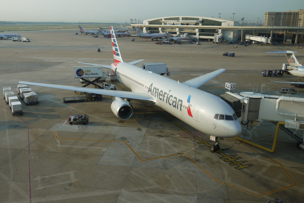
I wanted to hate American’s new look. The boring grey. The arial font. The apparent lack of imagination on the part of the designers, lazily draping the word “American” across the fuselage instead of stylizing it. But despite a style that might be more at home with other stellar designs such as the Yahoo! home page, I find that I hate it less and less every time I see a plane all dolled up in the new colors. It’s clean, modern, and hopefully over the years the scuff marks from the apron of the jetway won’t be as apparent as it is on the current fleet.
I still think they should have gone all retro and gone back to the 1930’s design . . .
